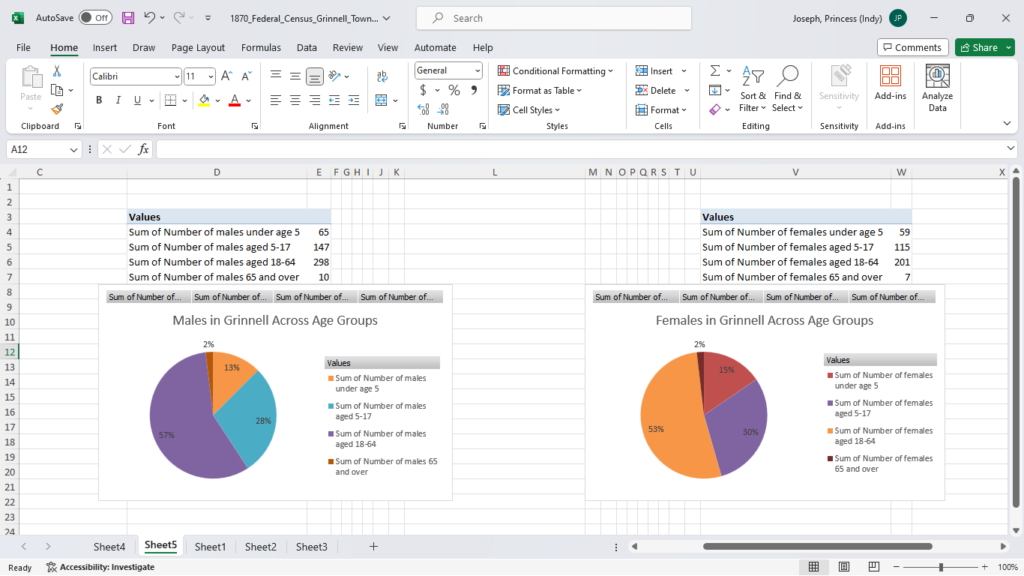
This was my first time using Pivot Tables to create charts, and I think it was a lot faster doing it this way than I how I would do it before, so I’m happy I know how to do this now.
I was able to create pie charts and bar graphs with the data. There were other visualizations that I could have done with the PivotTable, like line graphs, area charts and radars, but based on how I know to use them, those didn’t seem like appropriate ways to visualize the census data we were given. There were other visualizations, like scatterplot and histogram, that cannot be visualized using data from a PivotTable, according to Excel.
The visualizations make it easier to understand the data, I think. Instead of having to scroll to read through dozens of lines of data and remember most of it, the visualizations provide a sort of visual summary of whatever variable you are interested in. Some visualizations I made were slightly misleading, like a pie chart showing the countries that at least one member of the household was born in. If someone just looked at the pie chart without knowing that only a fraction of the population in Grinnell had a foreign-born person in their household, it would look like the pie chart was indicative of all households in Grinnell, instead of a subsection of households. I suppose that’s why chart titles are very important, because they can clarify that sort of uncertainty or misreading of a chart. The bar chart from the exercise (comparing the average ages of males and females in Grinnell) surprised me because there was only a 3.5-year difference. I’m so used to hearing that men would marry much younger women, but based on the average ages this might not have been the case.